Intro
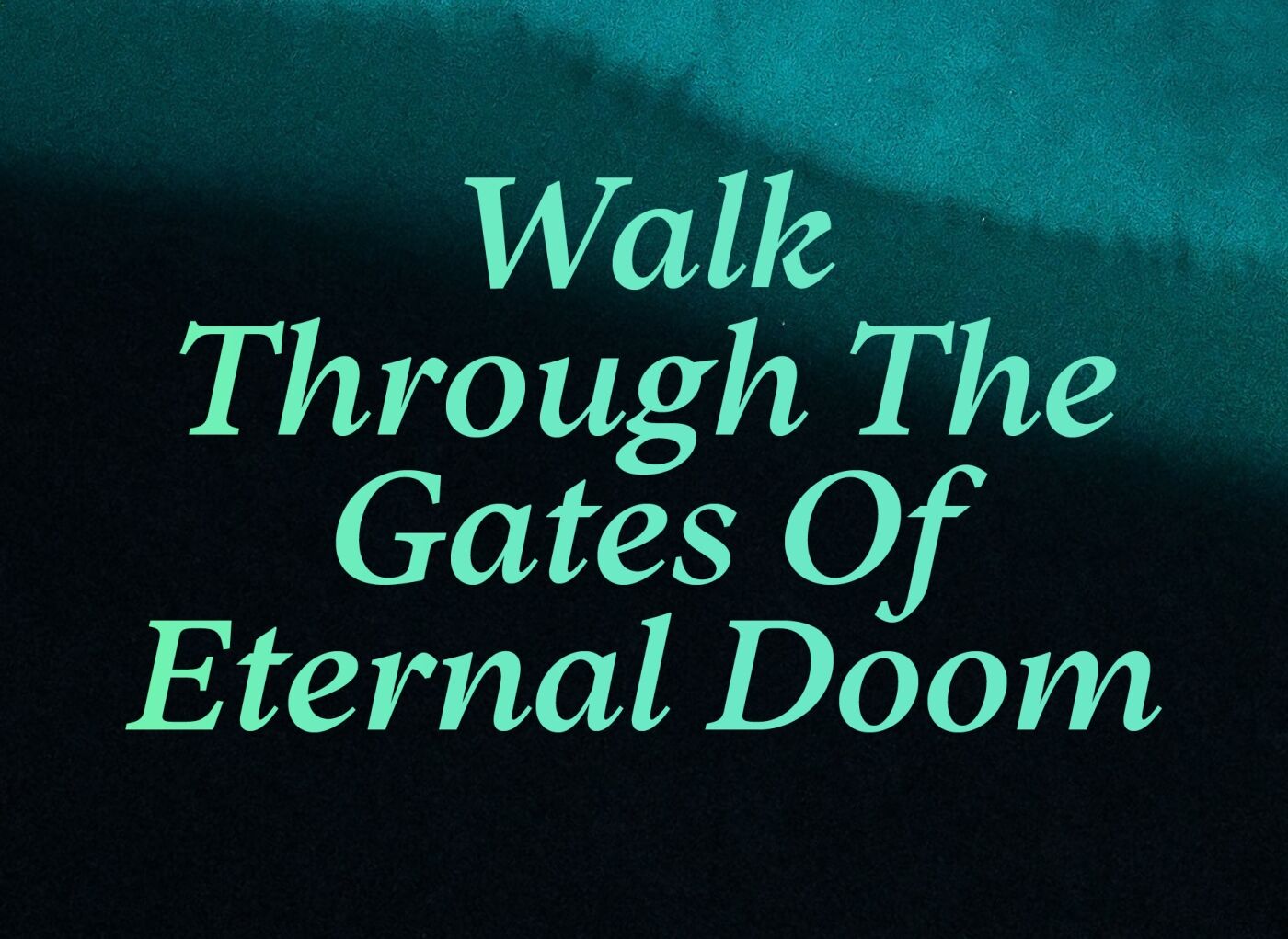
"Abandon All Hope Ye Who Enter Here"
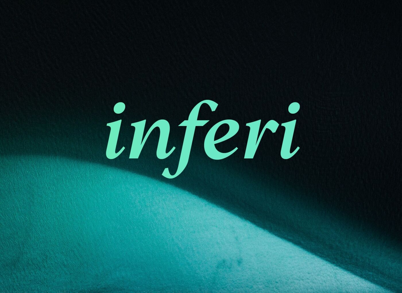
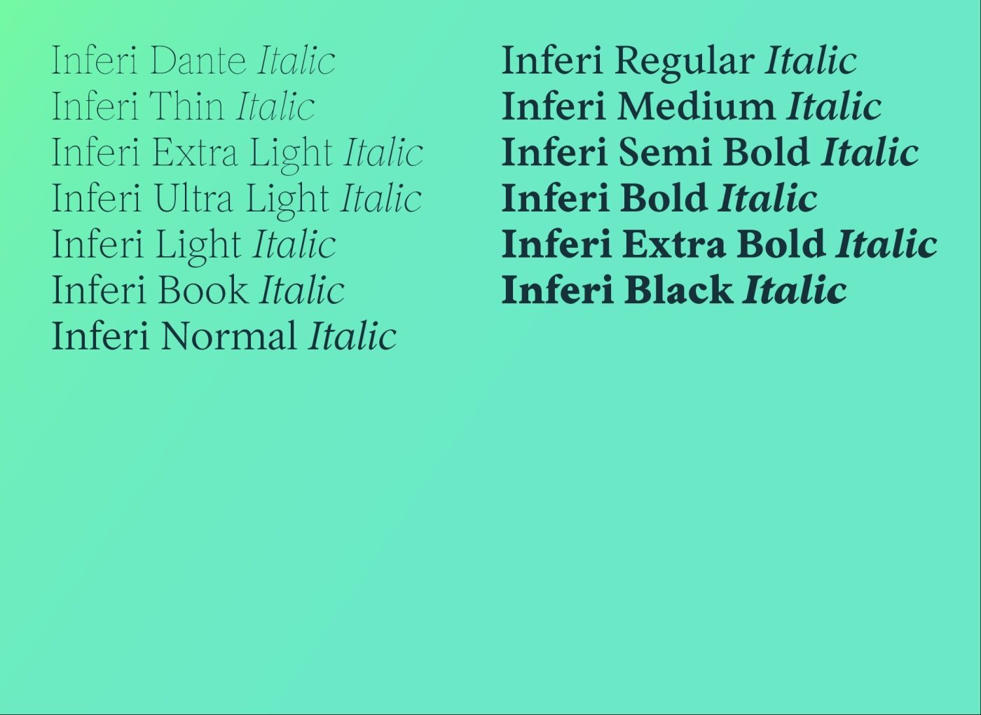
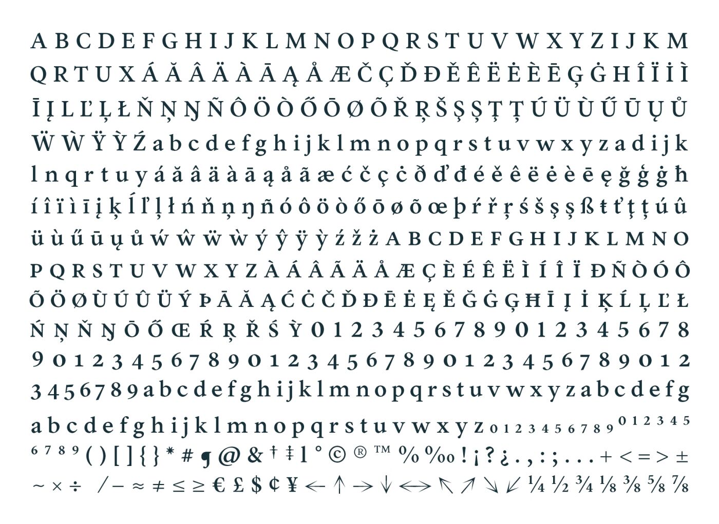
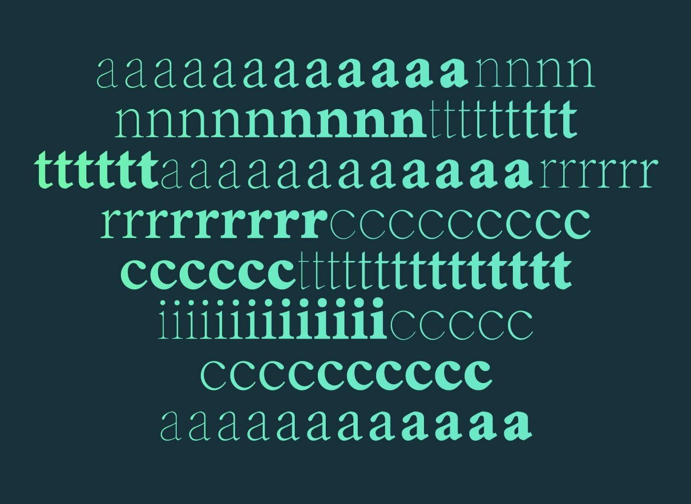
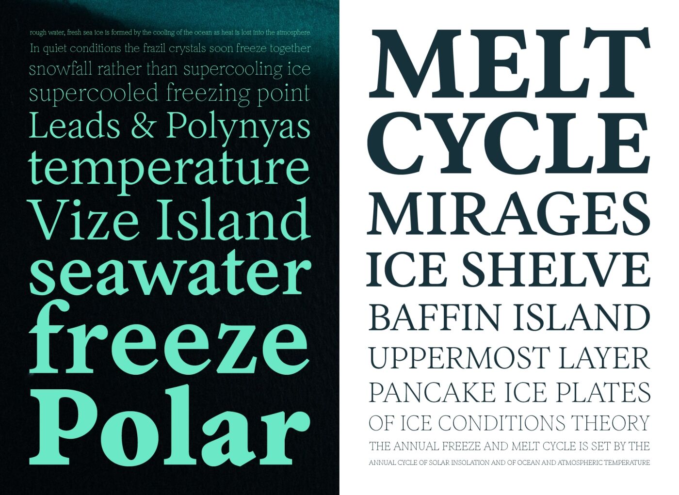
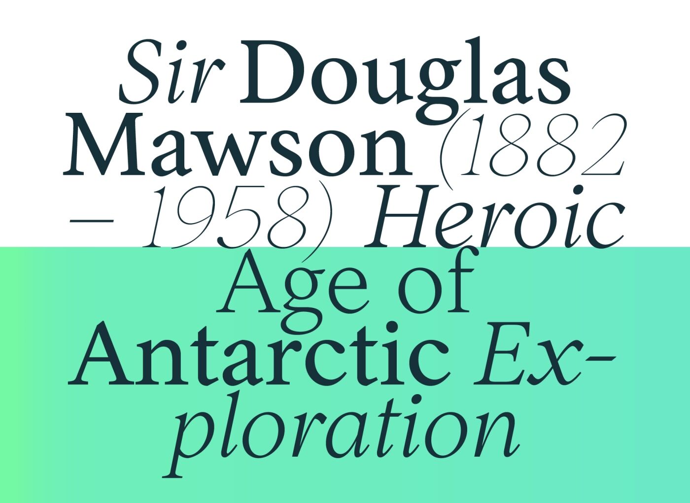
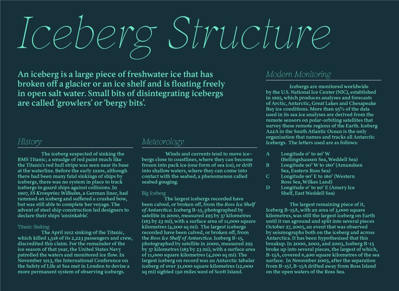
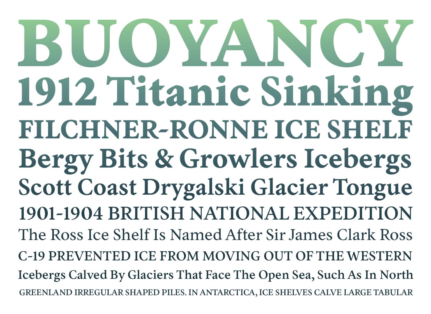
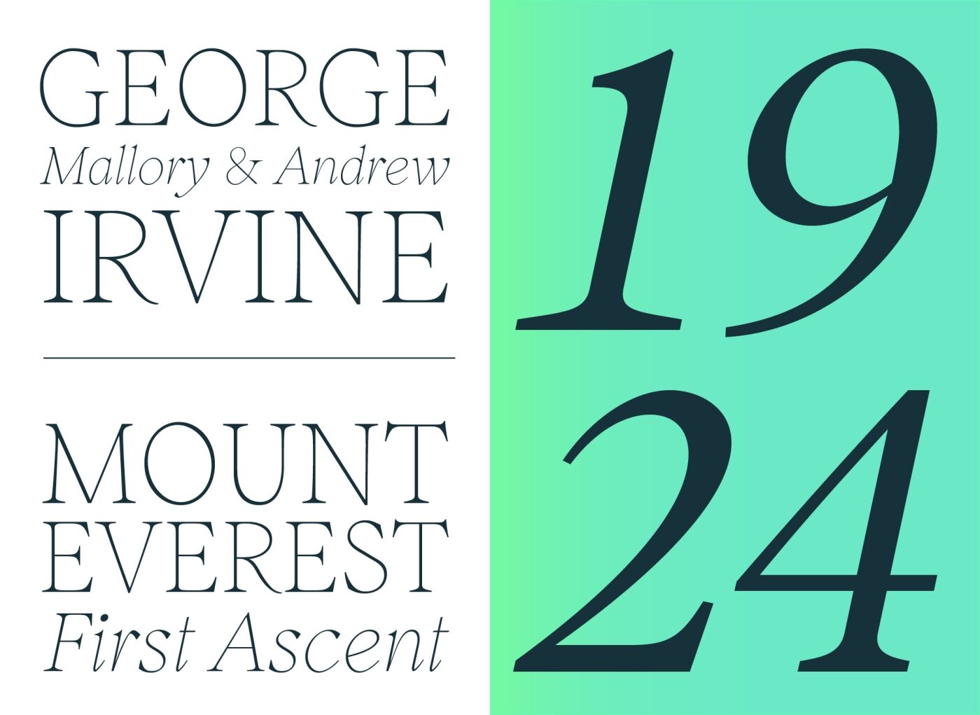
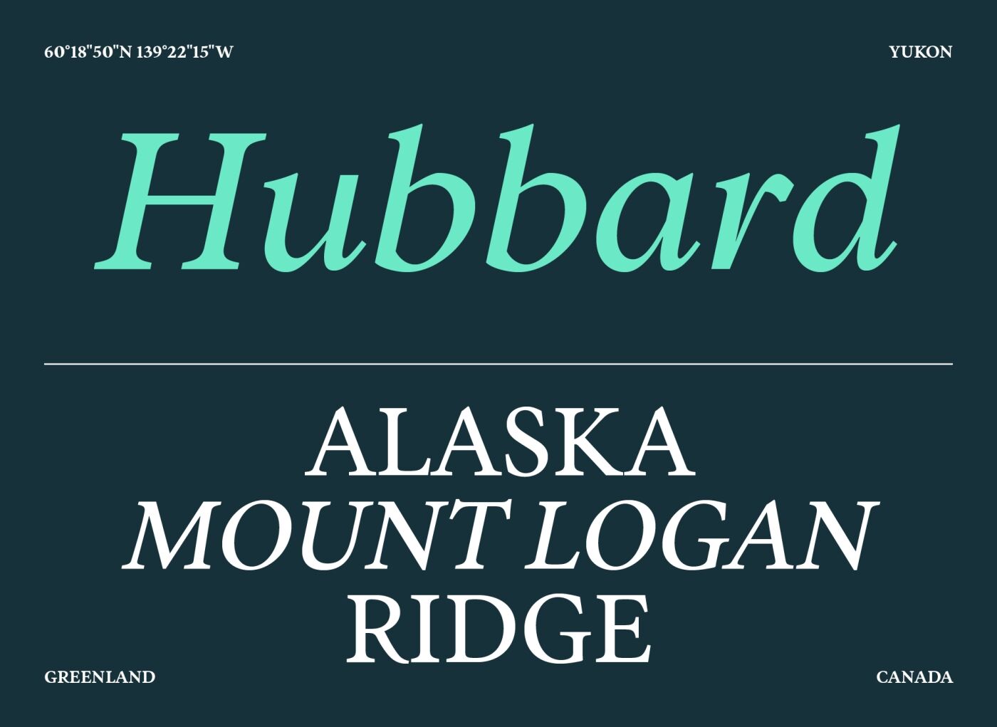
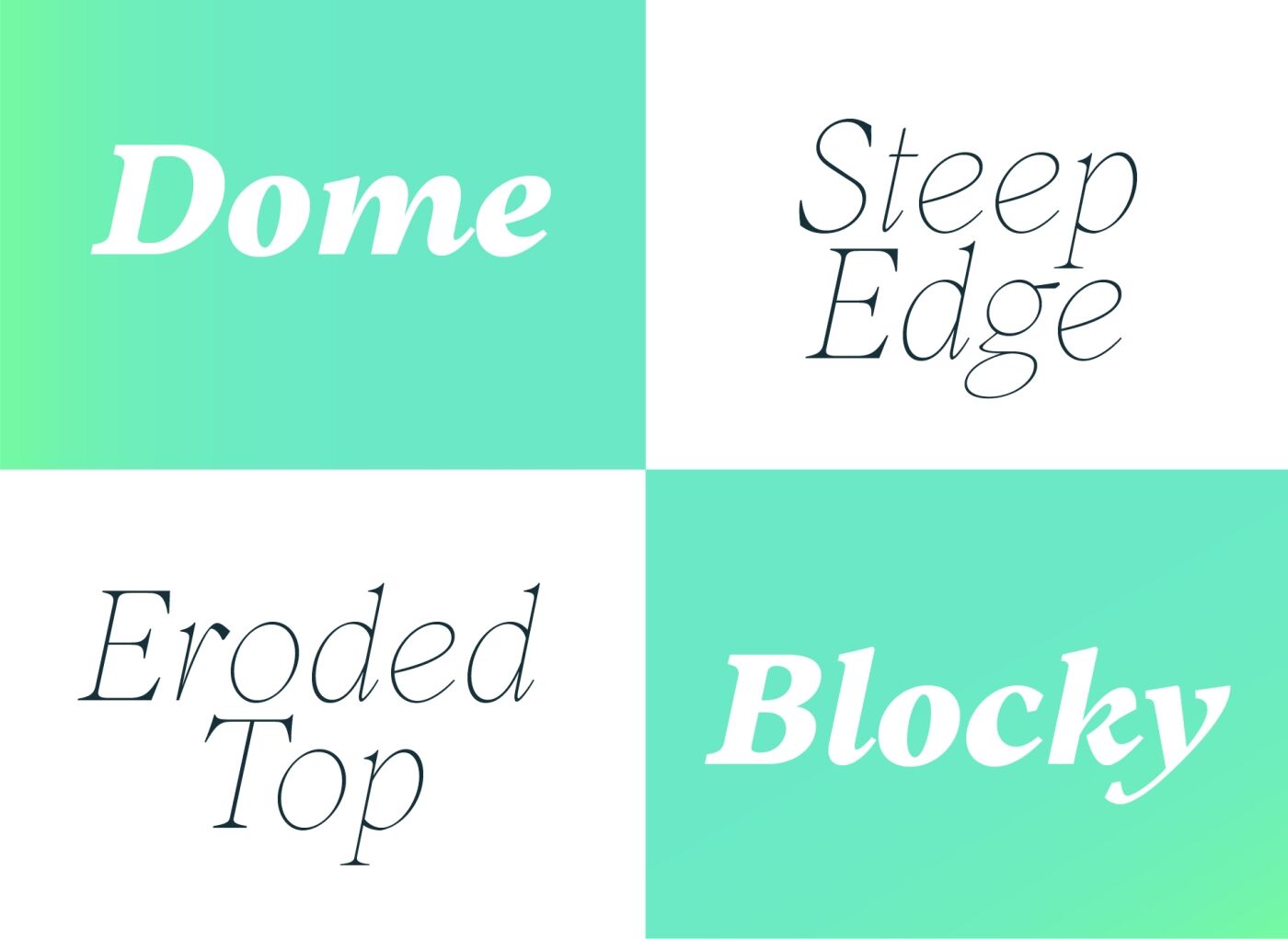
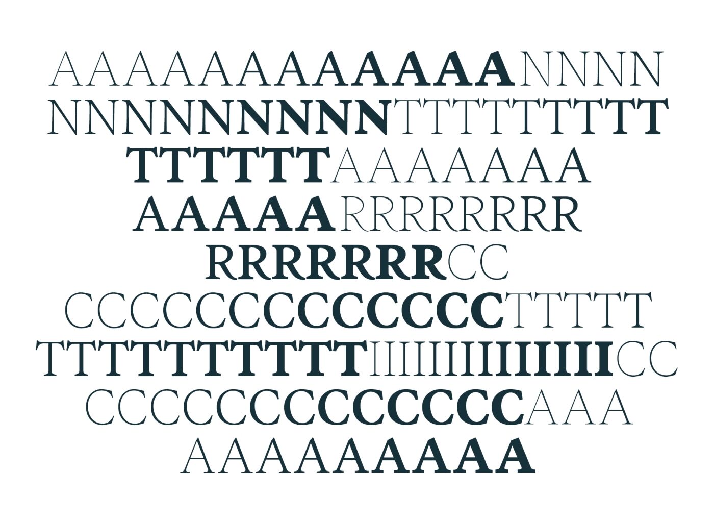
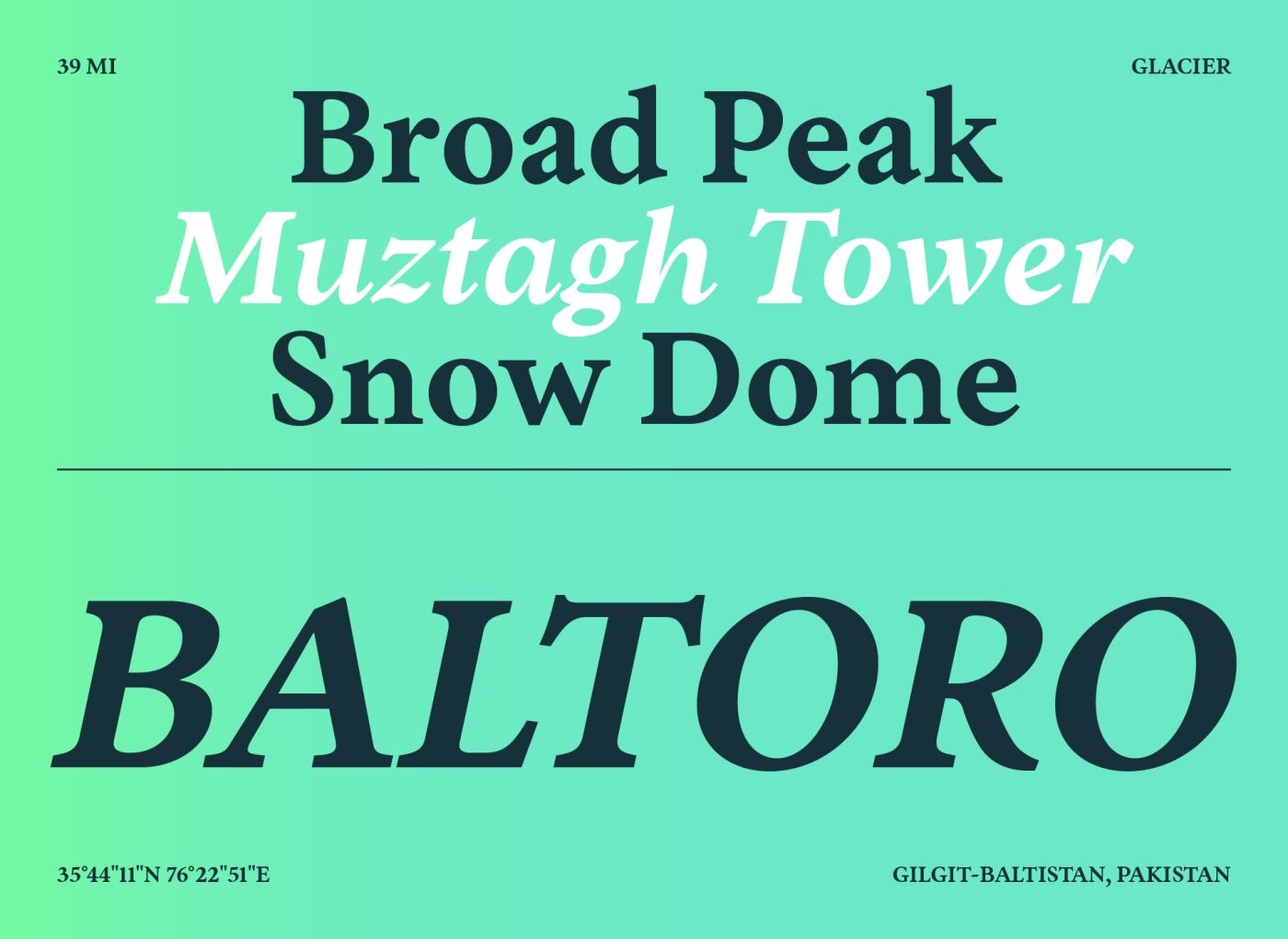
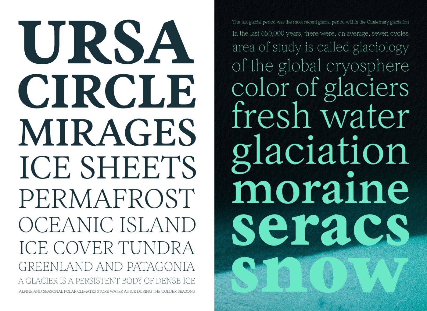
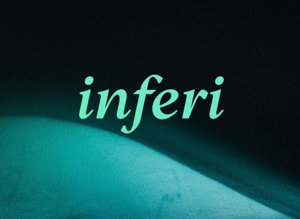
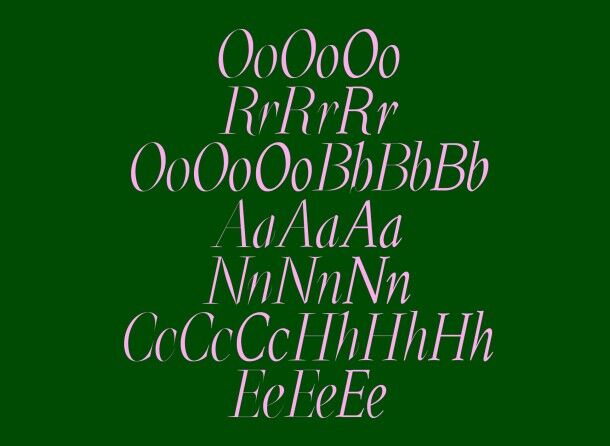
Inferi takes its roots in the Garalde era. To cover a large panel of uses it has been designed in various styles and weights, allowing one to have an extensive type-tool for any kind of usage. Whether the need would be on book design, poster design or editorial uses, Inferi will be a nice fit to complex type-shaping. If your goal is to reach for a printed-type feeling on digital medium (websites, apps and such), you will find Inferi to be your tool of choice. A well balanced family with squared edges and round finishes in the roman version, the italics cut deep into a more modern approach. Drawn with a careful “hand style” touch. A nice balance for complex layouts as the optical grey between roman and italics version will allow great legibility. Inferi is a bridge between calligraphy and letterforms carved in stone: it breaks between smooth curves and straight angles.
