LOUIS VUITTON - CITY GUIDE
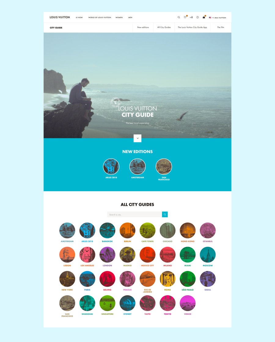
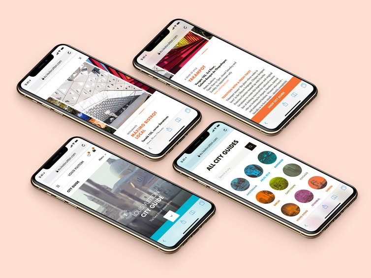
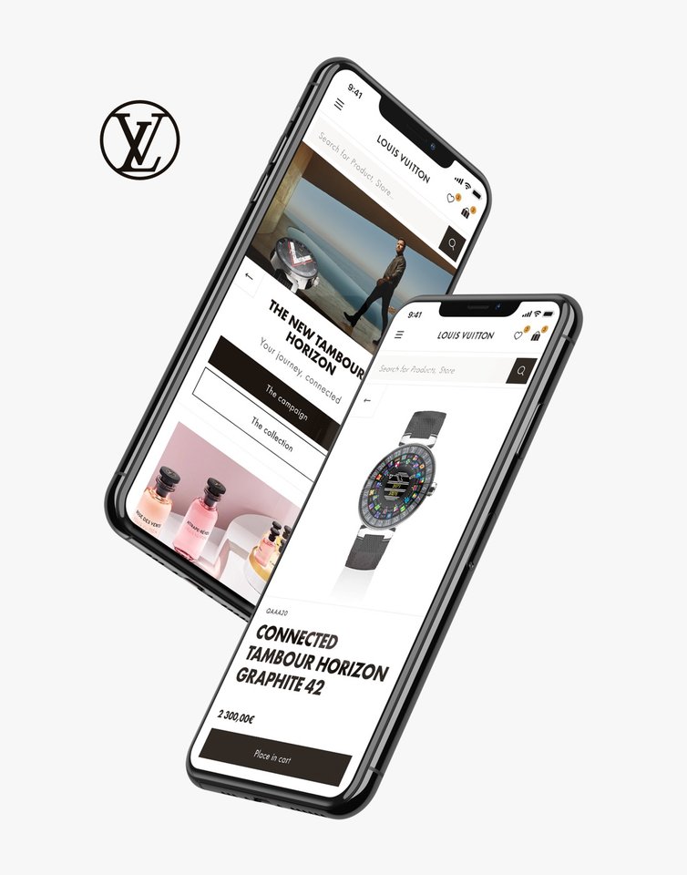
Following my work on Louis Vuitton Website Revamp , I was asked to redesign the Louis Vuitton City Guide landing page.
There was 2 main objectives with this project :
First, refresh an outdated landing page that wasn't making up anymore to the high editorial standards of the Louis Vuitton City Guides books. Second, be one of the first "real-world" implementation of the new design sytem built during the revamp of the main website.
By discussing with our digital production team we aligned ourselves to this approach for the redesign:
– Build a new "hybrid" art-direction, mixing elements from the design system and visual metaphors from the City Guides themselves
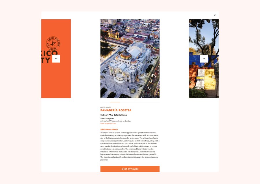
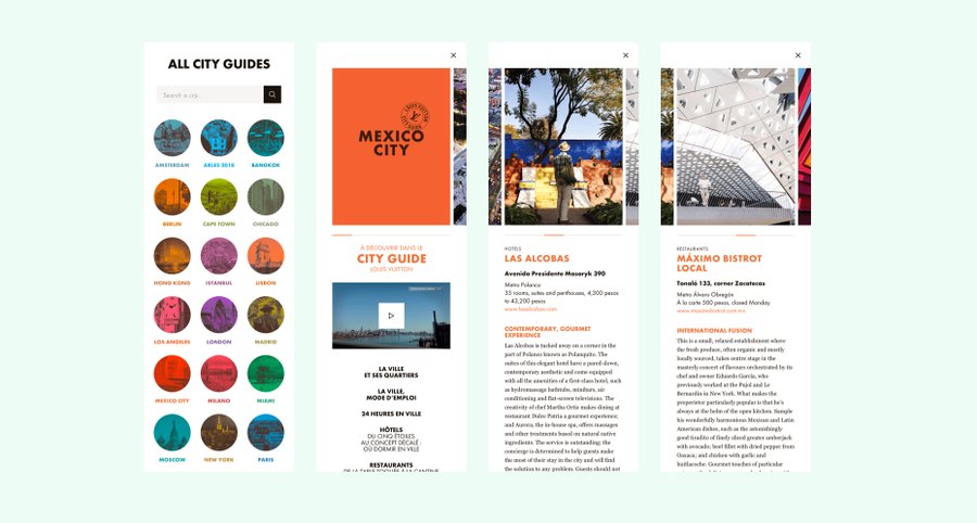
– Help new clients get a sneak peek of what's inside a City Guide
– Highlight new and updated editions
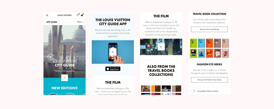
– Present the carefully crafted iOS City Guide app and give choice to clients wether to buy digital or physical editions of the guides
+ bonus, pioneer a new approach to accessibility: a simple switch to enhance contrast; hoping this will be soon implemented website-wide on pages that are not color-accessible yet (everything else is).

