TAM (Team Autre Monde)
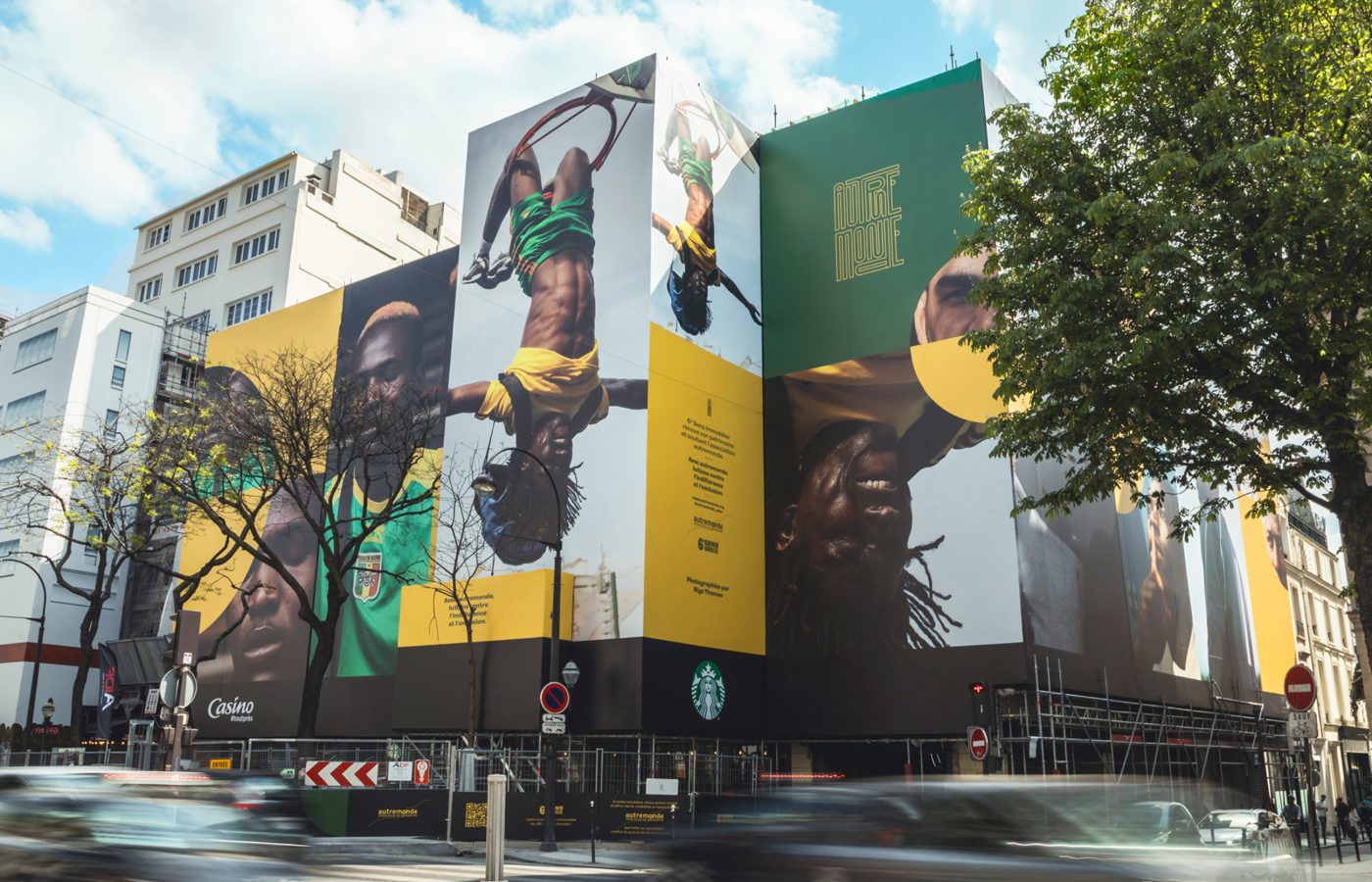
Branding for a solidarity football team.
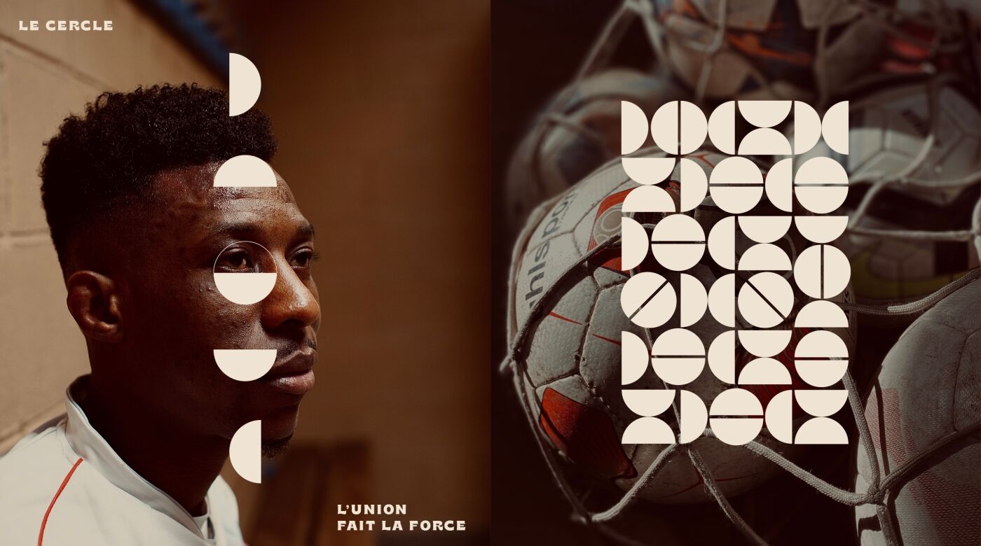
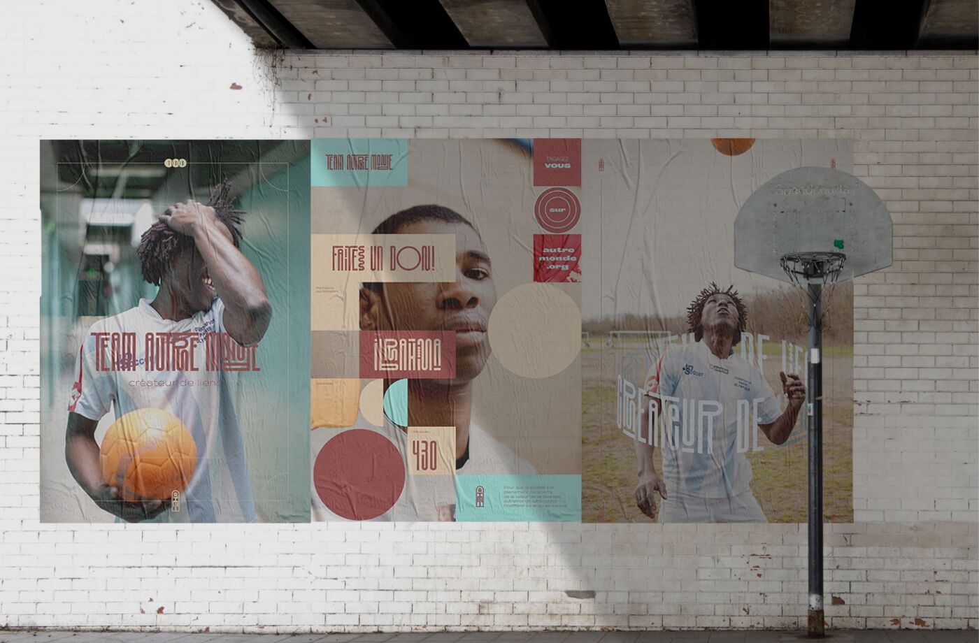
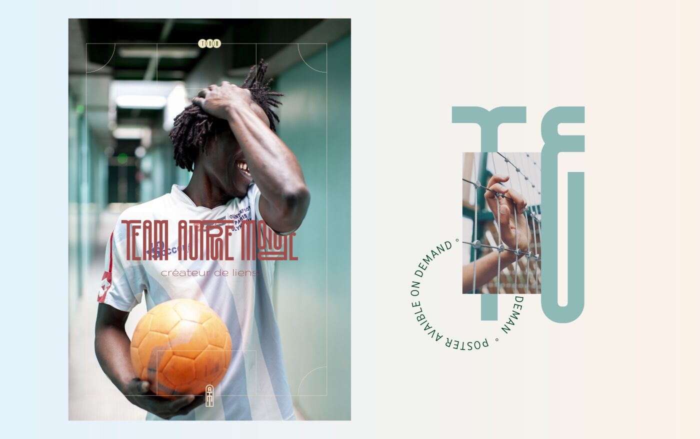
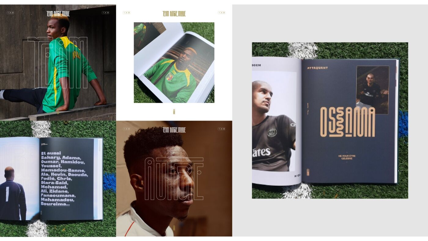
Our Branding emphasizes the link between players and the world.
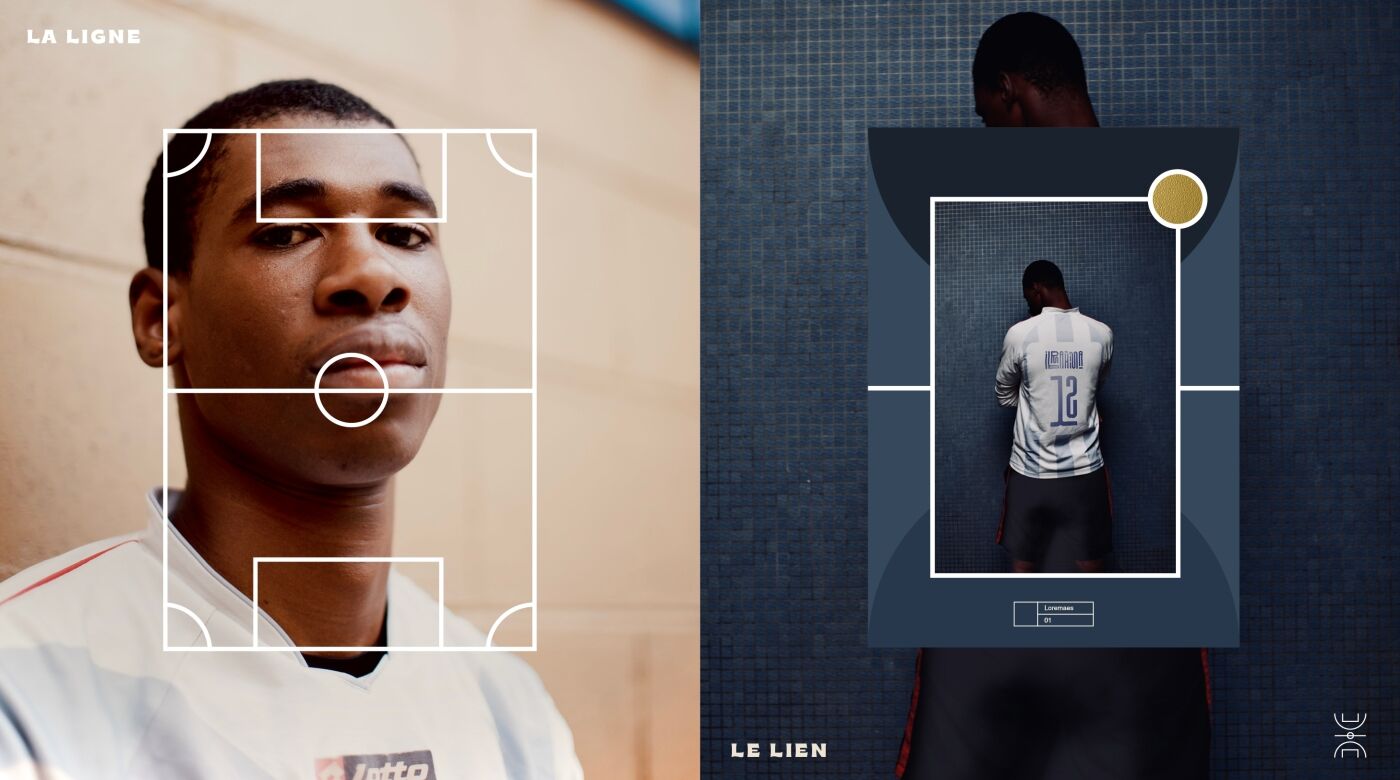
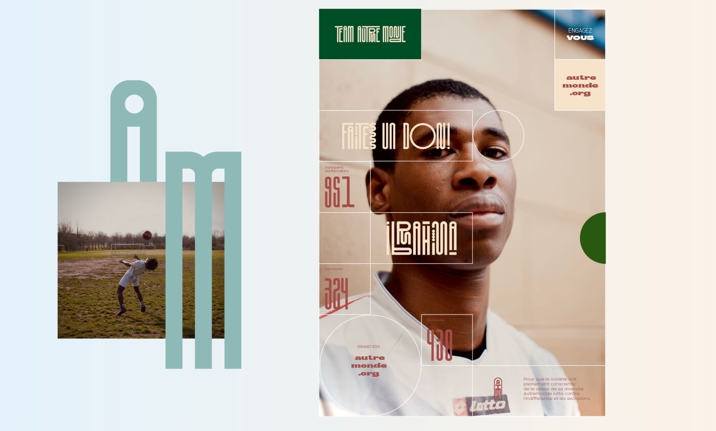
It is a branding which is both social and united, but which is also inspired by the graphic codes of football teams.
The visual identity remains humble, warm and friendly.
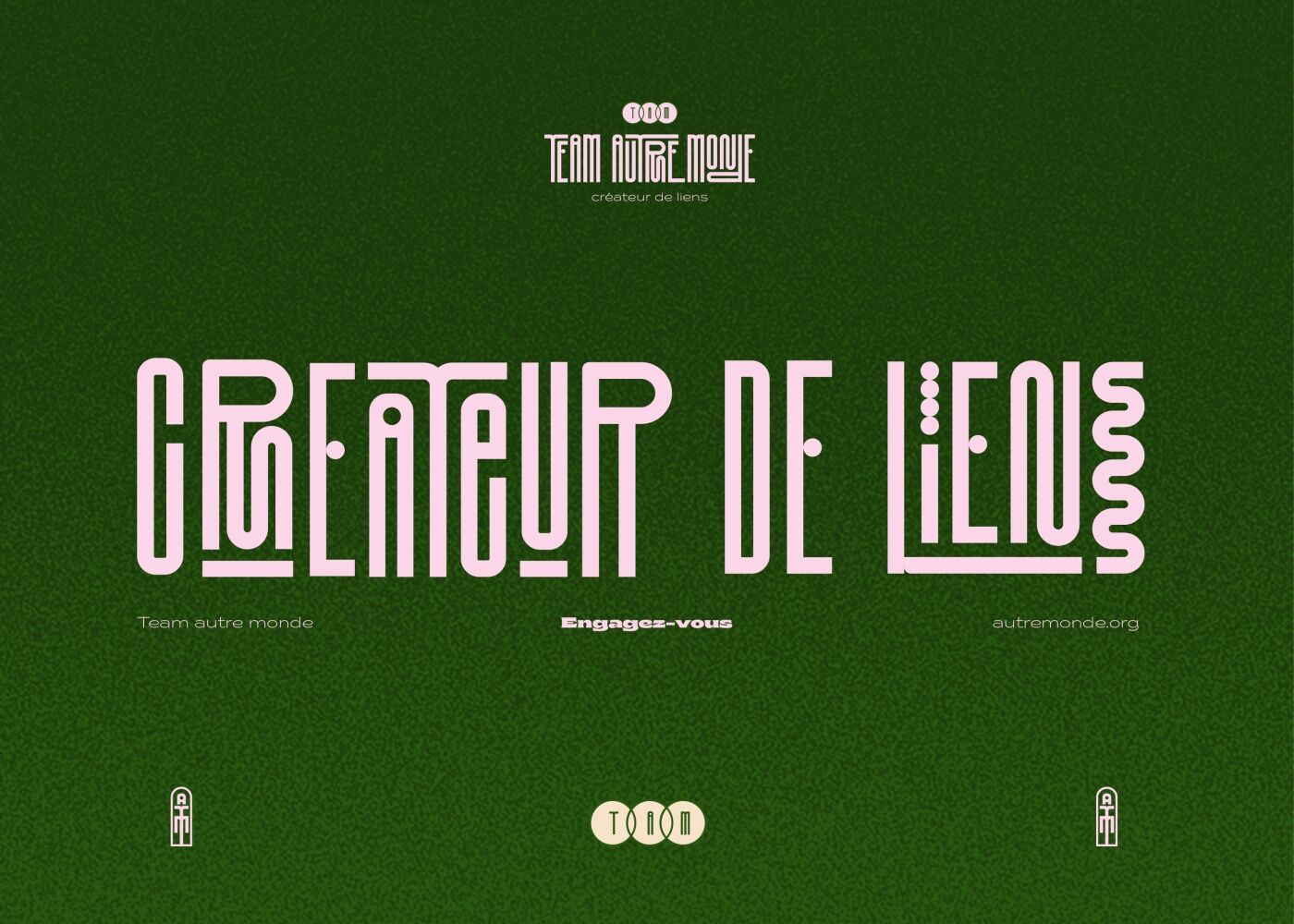
Our creation is colorful, positive and multi-ethnic. The logo is inspired by the origin of each player,
it becomes entangled, it intertwines to form only one. It strengthens the team spirit.
The coats of arms and monograms are inspired by the different origins of each player.
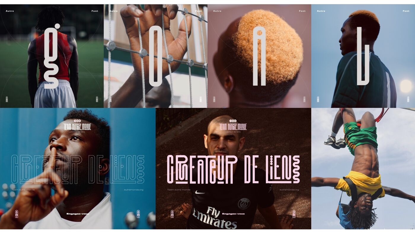
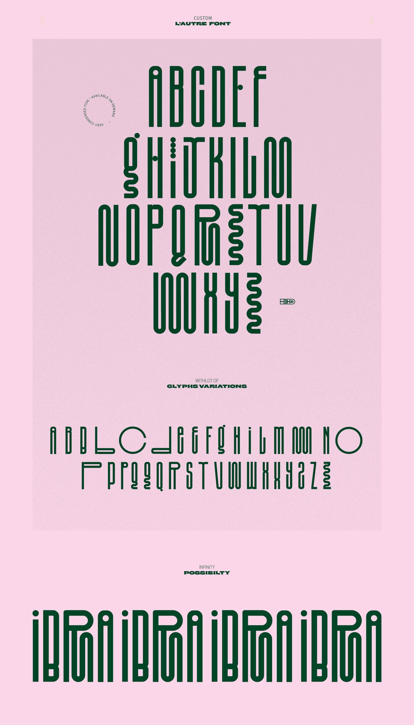
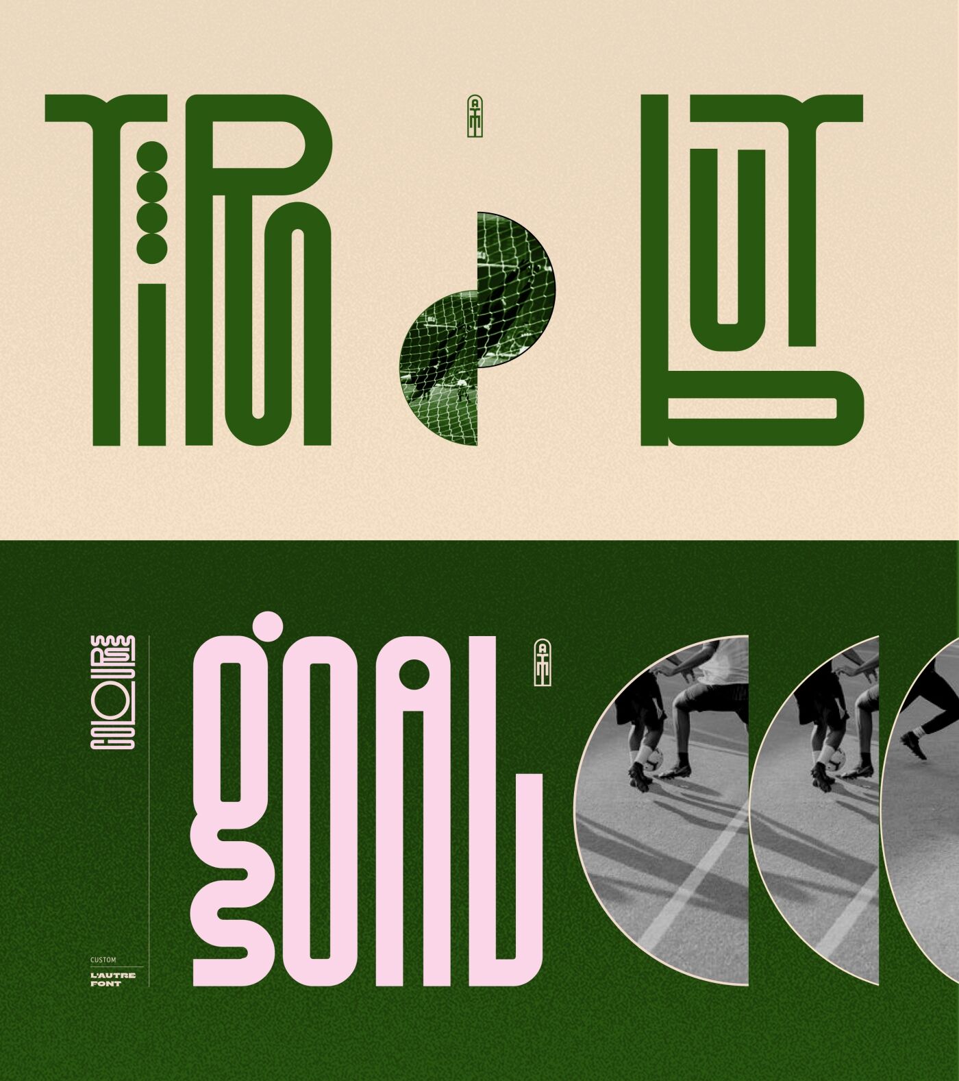
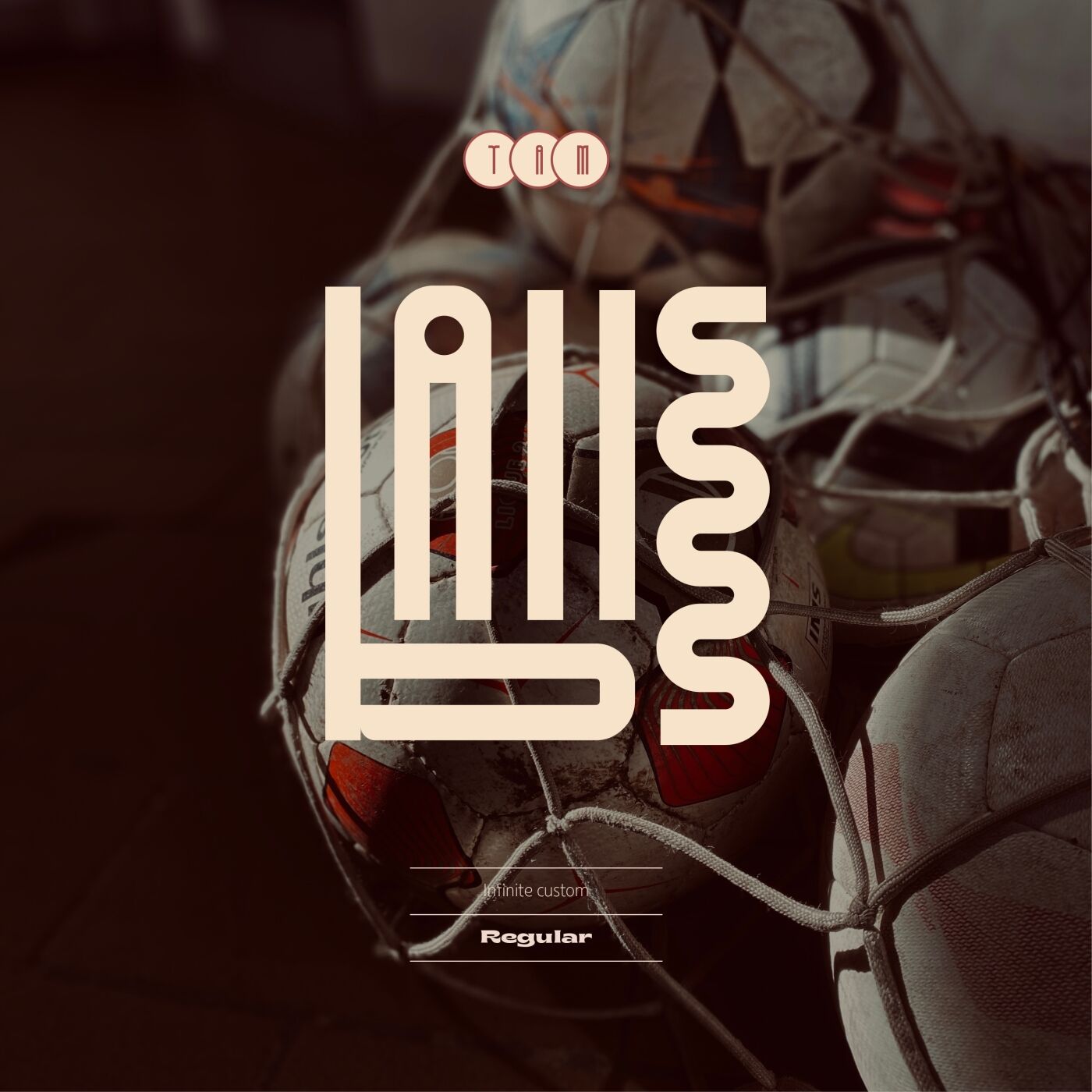
The typography is inspired by the origins of each players.
There is strength in unity, here is the signature of this typography.
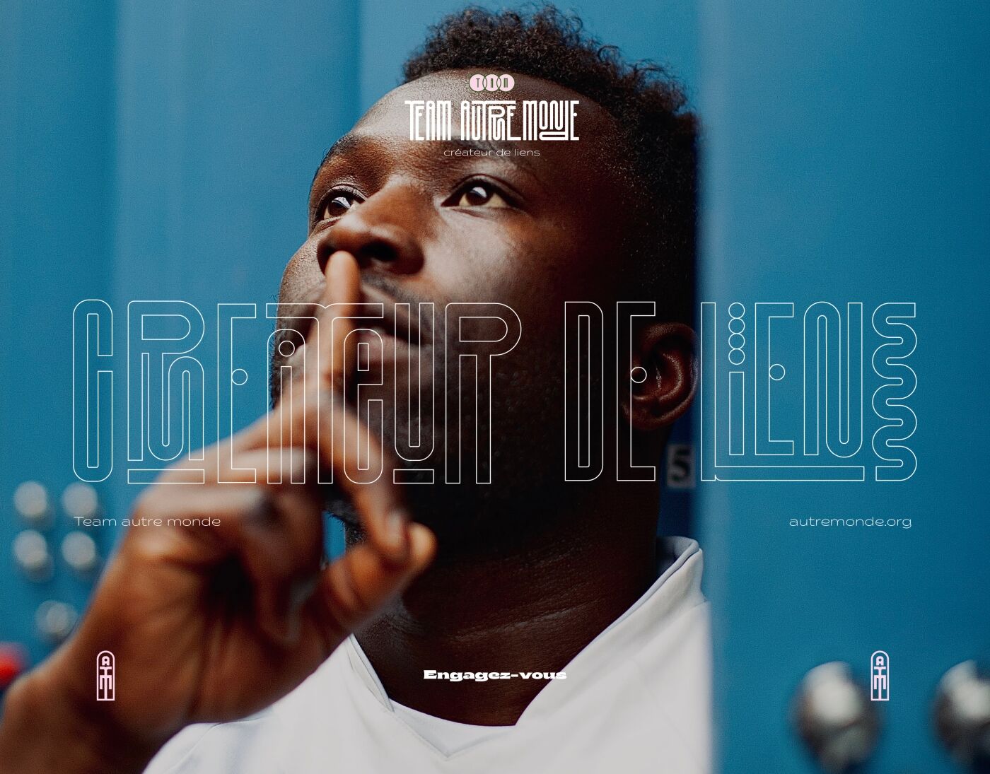
It allows various and varied typographical games to highlight a player,
a word, a quotation.
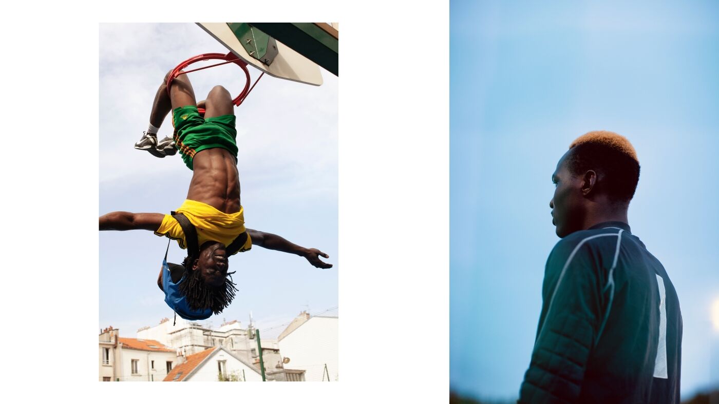
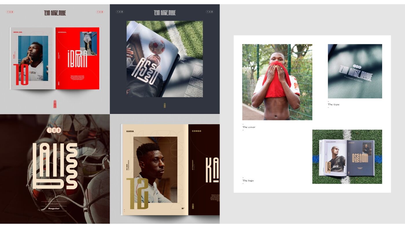
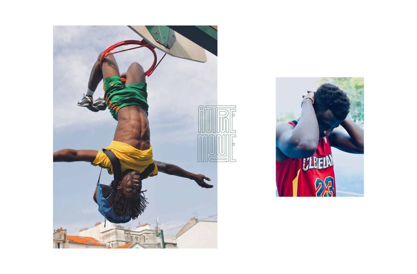
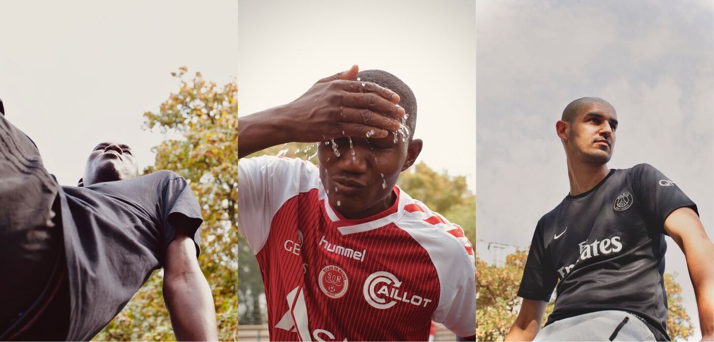
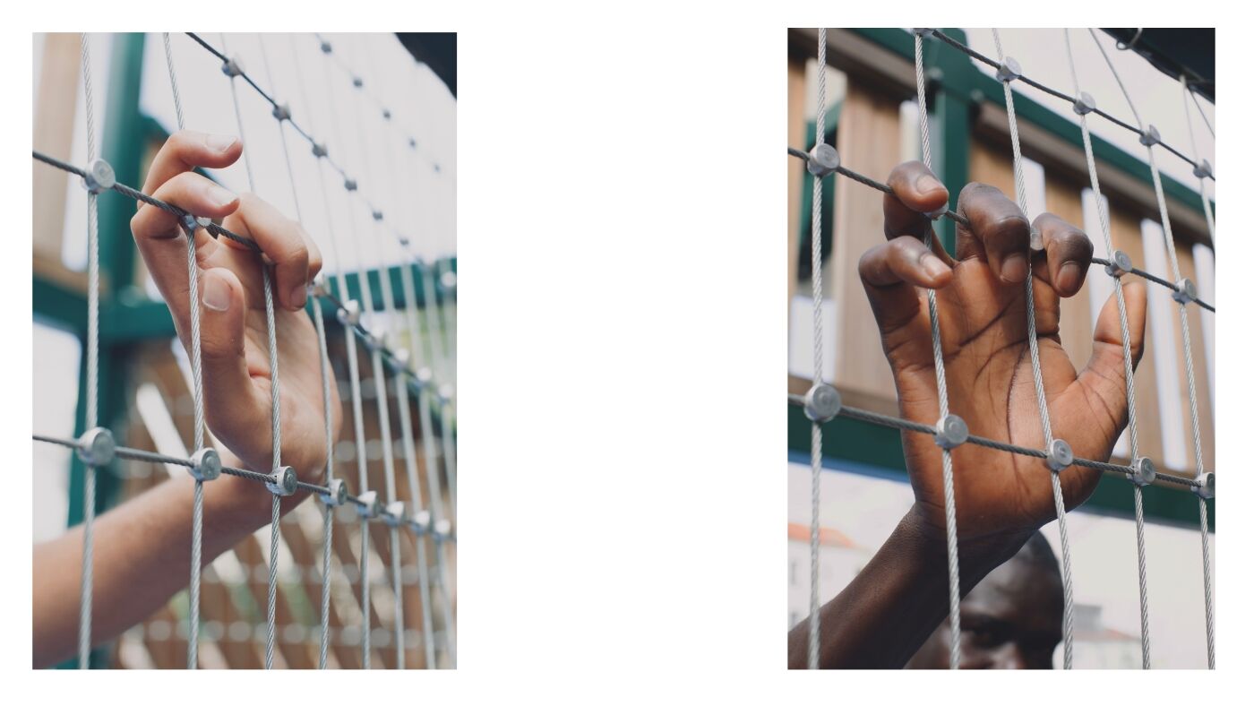
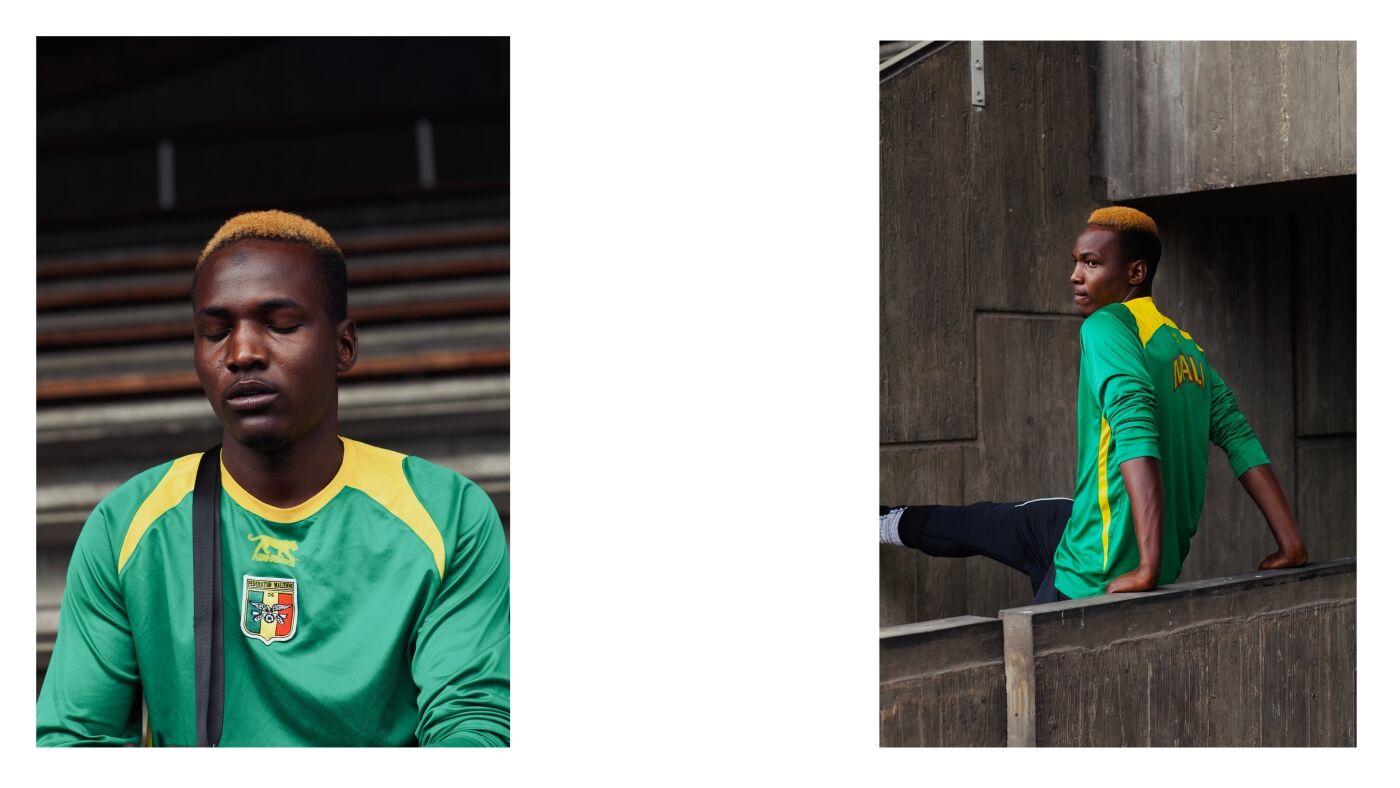
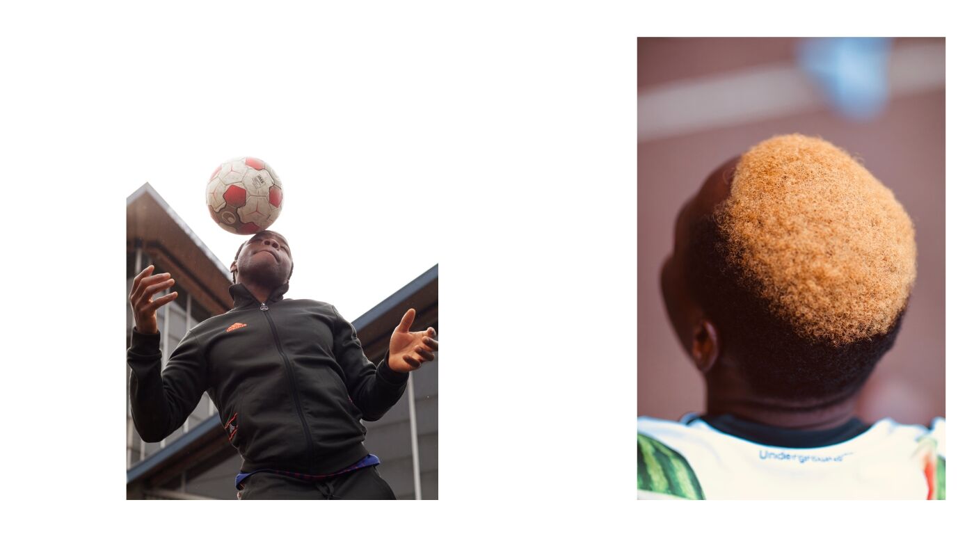
The photographic universe
The photographic report is authentic, warm and touching.
It highlights each player, each story, each journey.
Natural light, photos taken on the spot, everything is raw.
Photos : @alys thomas
